
I ruined a first date once because of a cream blazer. Not because it looked bad exactly, but because I paired it with a pink that fought it instead of flattering it, and I spent the whole night tugging at my sleeves feeling like I’d shown up in someone else’s clothes.
Light pink and cream should be one of the easiest color combos in your closet.
Soft, romantic, endlessly pinnable. But get the undertones wrong, or the proportions off, and you end up looking washed out instead of polished.
I’ve been building outfit boards and actually wearing this palette for years now, and I keep seeing the same 12 mistakes pop up, both in my own closet mishaps and in the outfits people pin and never quite recreate.
So let’s go through them one by one. IMO, once you know what to watch for, this combo becomes almost foolproof.
Here’s a quick cheat sheet before we get into the details:
| Mistake Type | What It Looks Like | Quick Fix |
|---|---|---|
| Undertone clash | Warm cream next to icy pink | Match warm-to-warm or cool-to-cool |
| Texture flatness | Two matte, similar-weight fabrics | Add satin, knit, or linen contrast |
| Proportion imbalance | 50/50 pink and cream split | Go 70/30 or 60/40 instead |
Now, onto the actual mistakes.
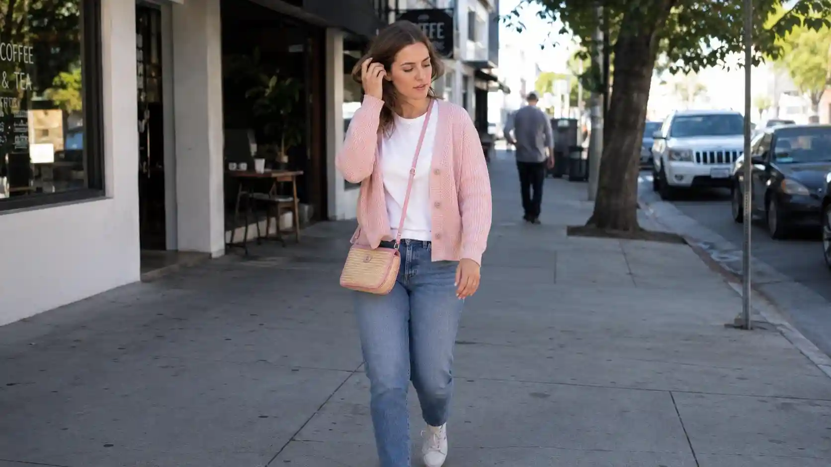
1. Ignoring undertones completely

This is the big one, and it trips up almost everyone at first. Pink and cream both come in warm and cool versions, and mixing a peachy, warm pink with a cool, blue-based cream makes both colors look slightly off, even if you can’t immediately say why.
Warm pinks (think dusty rose or salmon-pink) pair best with warm creams that lean ivory or buttery.
Cool pinks (baby pink, powder pink) do better with a cream that has a grayer, cooler base. Hold the two pieces next to each other in daylight before you buy. If one looks dingy or the other looks garish, you’ve found a clash.
2. Treating cream and white as the same color
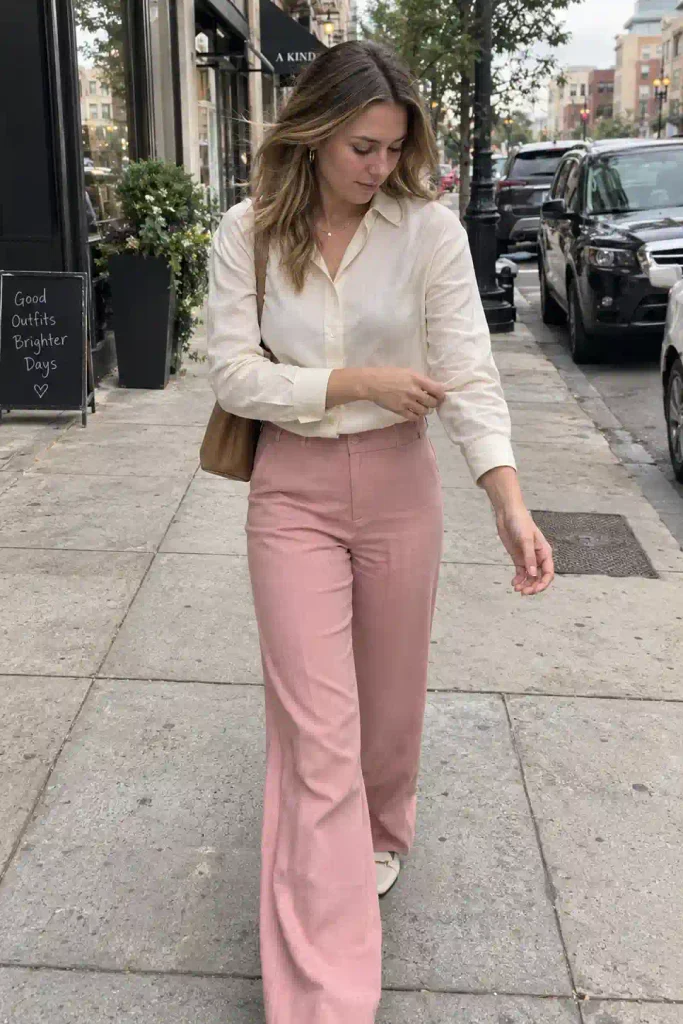
Cream is not white. This sounds obvious written down, but I’ve watched people pair a stark white blouse with pink trousers and call it a “pink and cream” outfit. White has almost no warmth to it.
Cream carries a yellow or beige undercurrent, and that warmth is exactly what makes it play so nicely with pink in the first place.
If your “cream” piece reads cool or bright under store lighting, check it again outside.
A lot of off-white pieces are actually just pale gray or blue-white, and they’ll flatten your pink instead of softening it.
3. Splitting the outfit 50/50

An even split between pink and cream tends to look accidental, like you grabbed whatever was clean that morning rather than styled anything.
The eye doesn’t know where to land.
Give one color the lead. A cream dress with pink accessories, or a pink top with cream trousers and a slightly darker pink shoe to tie it together, both work better than an even halfway split. Aim for roughly 60/40 or 70/30, and let texture do the rest of the work.
4. Skipping texture entirely

Two matte pieces in similar weights, even in perfectly matched tones, can look flat and a little lifeless.
Wow, this one took me embarrassingly long to figure out. I used to wonder why my “correct” pink and cream outfits still looked boring on camera, and it was always this.

Bring in contrast through fabric, not just color:
- A satin cream cami under a matte pink cardigan
- Pink linen trousers with a cream ribbed knit
- Cream tweed against a smooth pink silk scarf
Texture variation is what separates a Pinterest-worthy outfit from a flat one, and it costs nothing extra since you probably already own pieces in different fabrics.
5. Forgetting your own skin undertone
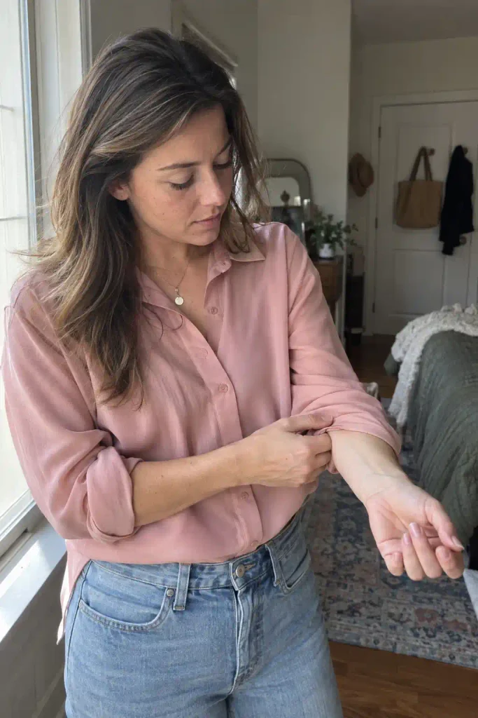
Outfit color theory isn’t just about the clothes talking to each other. It’s also about how they sit against your skin.
Someone with cool, pink-toned skin can look washed out in a very pale, cool pink, while the same person might glow in a warmer blush.
If you’re not sure of your undertone, check the veins on your wrist in natural light. Blue or purple veins usually mean cooler undertones.
Green veins usually mean warmer ones. This five-second trick has saved me more bad purchases than I’d like to admit.
6. Over-accessorizing a soft palette
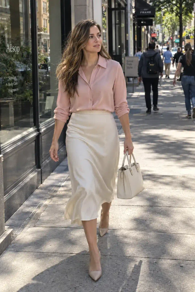
Light pink and cream already read as delicate and put-together. Piling on gold chains, patterned scarves, statement earrings, and a bold bag all at once competes with the softness instead of complementing it.
Pick one statement piece and let everything else stay quiet.
A single structured bag or one pair of bold earrings will do more for the outfit than five smaller accessories fighting for attention.
7. Choosing the wrong metal tones
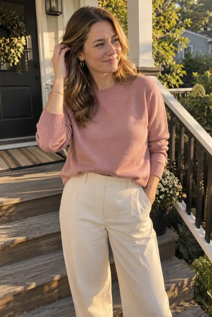
This one’s small but it matters more than people expect. Warm pinks and creams generally pair better with gold, rose gold, or warm-toned brass jewelry.
Cooler pinks lean better toward silver or platinum tones.
Mixing metals isn’t a crime, plenty of stylists do it on purpose, but if your whole outfit is warm-toned and you throw on cold silver hardware, it can read as mismatched rather than intentionally eclectic.
8. Wearing it only in one season
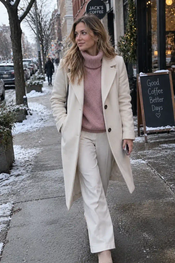
A lot of people file pink and cream under “spring only” and box it up the rest of the year. That’s a mistake, honestly.
A cream wool coat over a dusty pink turtleneck is one of the most underrated winter combinations out there, and pink and cream in heavier fabrics like corduroy or flannel reads completely differently than the breezy summer version.
Here’s a quick breakdown by season:
- Spring: light cottons, pastel pink florals, cream linen
- Summer: pink and cream in airy fabrics, minimal layering
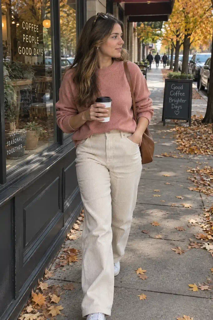
- Fall: cream corduroy, dusty rose knits, added texture
- Winter: cream wool coats, blush cashmere, richer pink tones
9. Letting the outfit look too matchy

There’s a difference between coordinated and matching, and light pink plus cream sits right on that line.
If your top, bag, shoes, and even your hair accessory are all the exact same shade of pink, it can start to look costume-like rather than styled.
Vary the shade slightly. A blush pink top with a dustier rose shoe still reads as coordinated, but it avoids that flat, single-tone effect that can feel a little juvenile on some body types and settings.

Quick side note, and I promise this connects back: I used to think the “no two exact matching shades” rule only applied to clothes, until a friend pointed out I’d made the same mistake with a monochrome pink kitchen.
Same energy, same fix. Vary the shade, even in spaces that have nothing to do with fashion.
10. Ignoring your undertone in makeup too

If you’re building a full look for a photo or an event, and yes, this matters for Pinterest-style flat lays too, your makeup needs to match the outfit’s temperature.
Warm pink and cream outfits look better with warm-toned blush and lip color.
Cool palettes pair better with berry or mauve tones rather than peachy ones.
This is a small detail that a lot of outfit guides skip entirely, but it’s the difference between a look feeling finished and feeling like an afterthought.
11. Using the wrong fabric weight for the occasion

Heavy, structured cream fabric paired with a delicate, sheer pink piece can look mismatched in formality, not just color.
A stiff cream blazer over a floaty chiffon pink dress sends mixed signals about how dressed up the outfit is supposed to be.
Match your fabric weights to your event. Structured pieces for work or formal settings, soft and flowy pieces for casual or romantic occasions.
When you mix formality levels intentionally, it can look edgy. When it happens by accident, it just looks like a wardrobe malfunction waiting to happen.
12. Not testing the outfit in natural light before committing
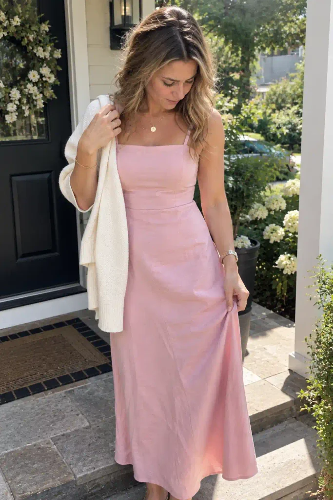
Store lighting lies. It’s designed to make everything look flattering, and pink especially can shift dramatically under fluorescent versus natural light.
An outfit that looks perfectly matched under store lights can look completely different the second you step outside.
Before a big event, or before you snap that outfit photo for your board, step outside or near a window and check the combo again.
This is insane how often it saves an outfit from disaster, and it takes 10 seconds.

If you’re curious about the color science behind why some pink and cream pairings just work better than others, this breakdown of how neutral and accent tones function together in a capsule wardrobe is worth a browse.
And if you want to see how stylists build entire seasonal palettes around a base neutral like cream, this guide to building a neutral capsule wardrobe covers a lot of the same undertone logic, just applied to a bigger wardrobe.
A few quick answers before you go

Does light pink and cream work for every skin tone?
Yes, but the specific shade matters more than the general combo.
Warmer skin tones usually do better with warmer, peachier pinks and buttery creams, while cooler skin tones look better in powder pink and grayer creams.
The pairing itself is flexible. The exact shade is where you need to pay attention.
Can I wear light pink and cream to a workplace?
Definitely, as long as you lean into structure.
A cream blazer with a soft pink blouse underneath reads as professional rather than overly delicate. Save the sheer, flowy pink pieces for outside the office.
What shoes go best with a pink and cream outfit?
Nude or cream heels are the safest bet since they elongate the leg line without competing with the outfit.

A darker rose or mauve shoe also works if you want a bit of contrast without breaking the palette.
So, which of these 12 have you already made without realizing it? I’d bet it’s the undertone one, almost everyone’s done that at least once.
Save this for your next closet edit, pin it to your style board, and let me know down in the comments which mistake you’re fixing first.
