
I’ve sat through three separate senior class committee meetings where the sweatshirt design got voted down by half the grade after it landed.
Every time, it was the same mistake: someone picked a font because it looked “clean” on a laptop screen, and it looked forgettable on an actual hoodie in the hallway.
If you’re on your class committee right now, or you’re just the friend everyone tags to “help pick something good,” this one’s for you.
I’ve pulled together 20 design directions that people genuinely wear past graduation day, not just the ones that get approved in a rushed vote and then sit in a closet.
Why most senior sweatshirt designs flop
Before the fun part, a quick reality check.
Most designs fail for one of three reasons: the text is too small to read from across a parking lot, the color scheme fights the school colors instead of working with them, or the whole thing tries to say too much at once.
A sweatshirt gets maybe two seconds of someone’s attention. IMO, that’s the number one thing committees forget.
You’re not designing a yearbook page. You’re designing something that has to read clean at a glance, on a rack, in a group photo, from across a football field.
Keep that in mind as you scroll through these.
The best ones on this list all share one thing: they say one clear idea and say it well.
Bold text-only designs that actually work
Text-based designs are having a moment on Pinterest right now, and there’s a reason.
They’re cheap to print, easy to read, and they age well because there’s no illustration to feel dated in five years.
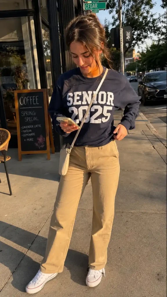
- Graduation year stacked big and bold across the chest, nothing else. Simple, but it hits.
- Class motto in a single strong sans-serif font, printed small on the left chest, not sprawled across the back.
- “Est. [founding year] – Class of [year]” styled like a vintage varsity patch.
- Inside joke or class nickname printed small, only understood by your grade. This one always sells the most because people want to feel like they’re in on something.
- A countdown format: “4 years. 1 crew.” Short, punchy, done.
I made the mistake once of pushing for a full paragraph quote on a hoodie back.
Nobody could read it from six feet away, and honestly, nobody tried. Lesson learned the hard way.
Illustration-based designs people photograph
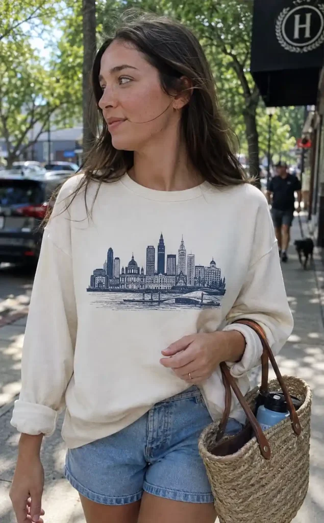
Illustrated designs cost more to print, but they’re the ones that end up on Pinterest boards and Instagram stories, which matters if your class wants the design to spread past the people who bought one.
- A simplified skyline or landmark from your town, printed in one color.
- School mascot redrawn in a modern, flat style instead of the old clip-art version most schools still use.
- A hand-drawn map of the school building with little icons marking hallway landmarks (the broken vending machine, the good bathroom, whatever your class actually jokes about).
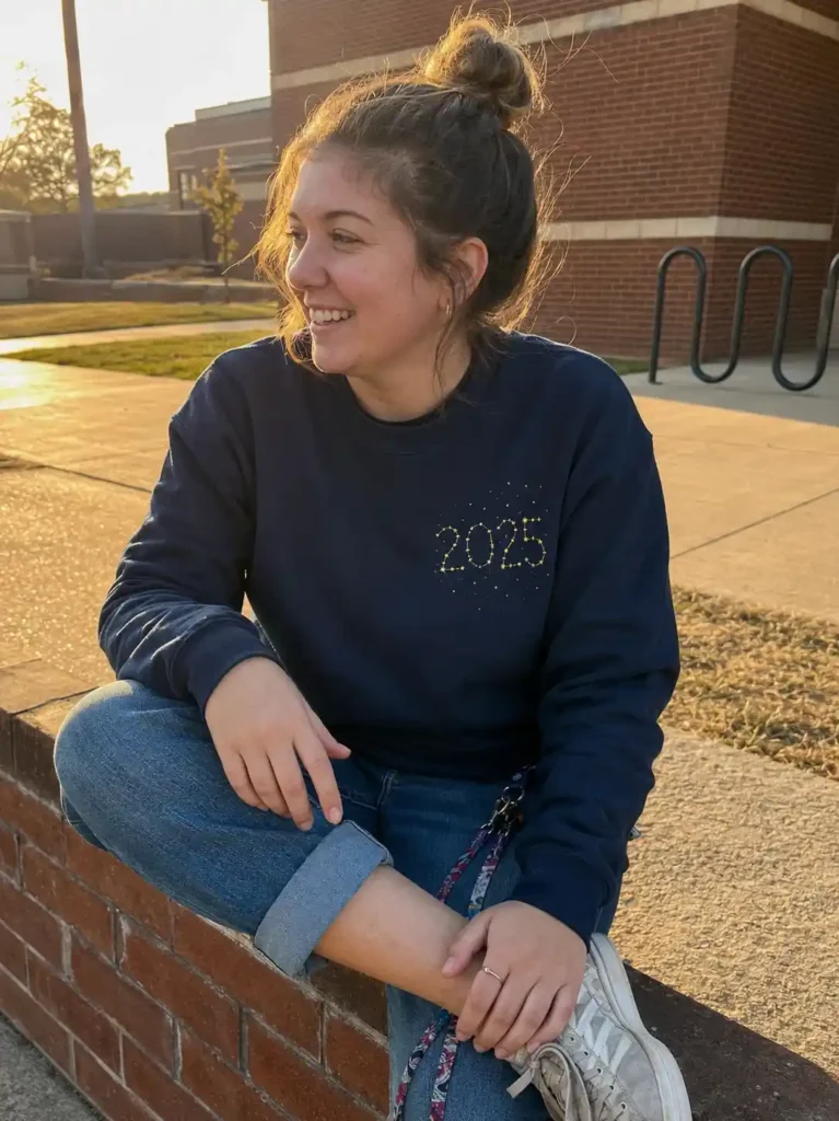
- Constellation design using the graduation year as star coordinates, which sounds odd written out but looks genuinely striking in gold ink on navy.
- A retro sports-jersey style number on the sleeve, paired with the class year on the back.
Retro and vintage-inspired designs
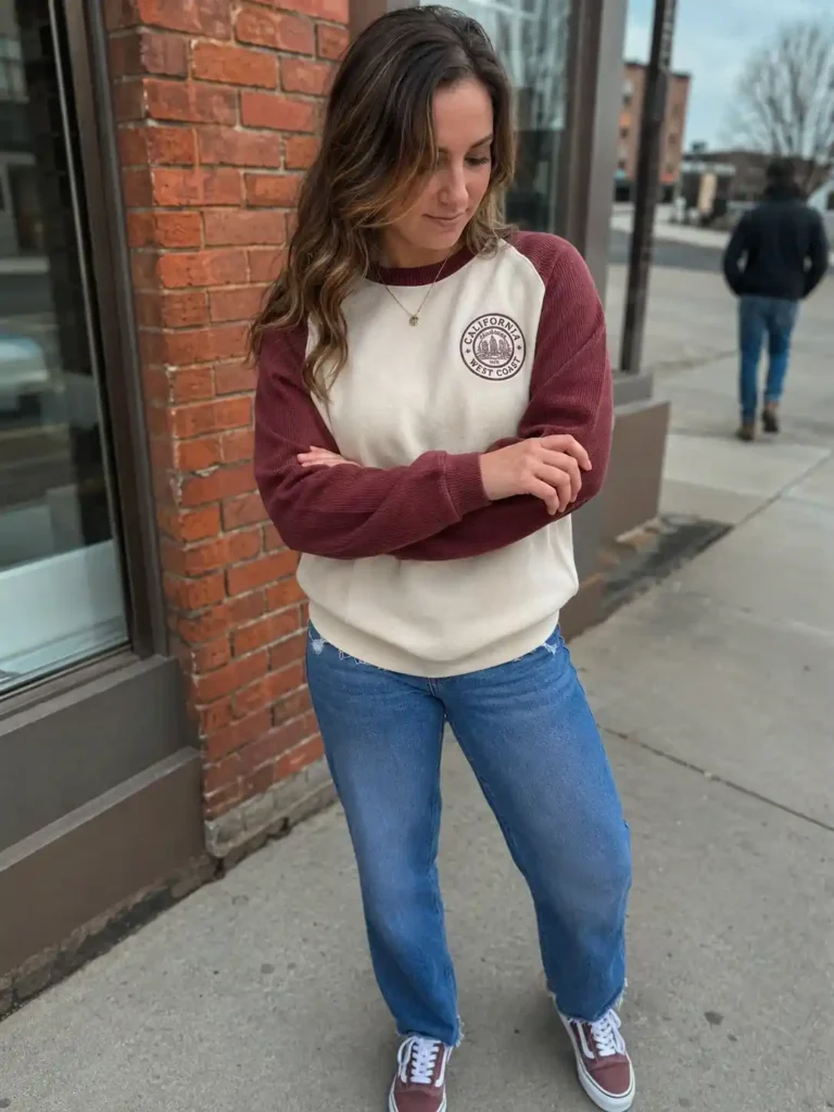
Vintage collegiate style has been trending across Pinterest for a couple of years now, and it doesn’t look like it’s slowing down.
It photographs well, and it doesn’t scream “school committee project.”
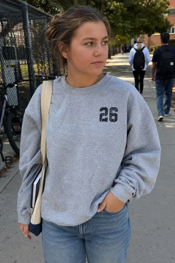
- Distressed varsity lettering with a cracked-ink print finish.
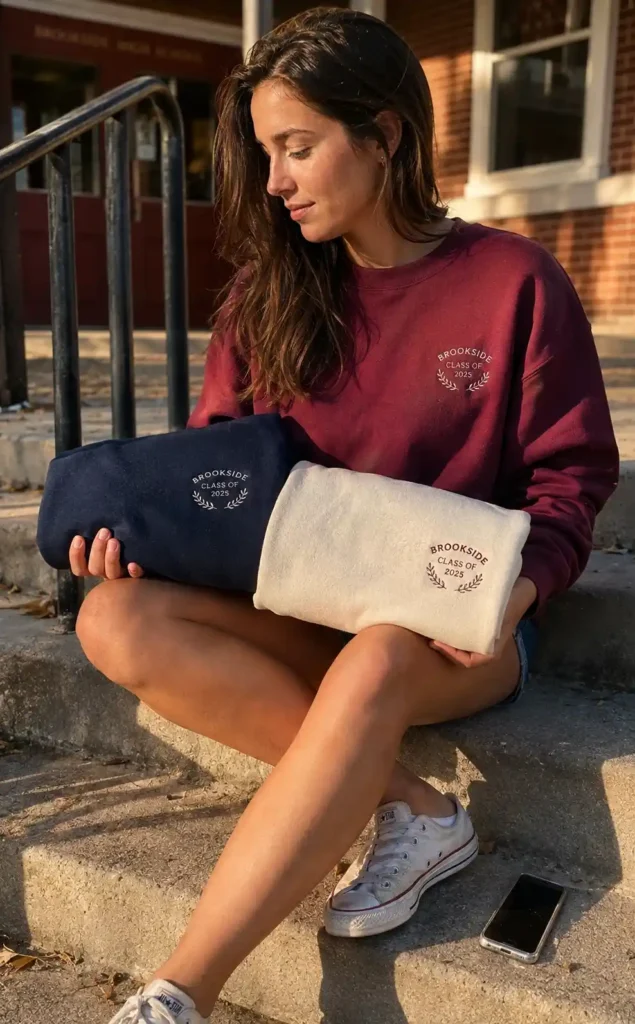
- Circle patch logo, styled like an old-school athletic crest, placed small on the chest.
- Two-tone color block sweatshirt (think 90s ringer tee energy) with the school initials embroidered, not printed.
- Faded sunset gradient background behind bold block lettering, popular for warm-weather graduation classes.
- A throwback font pulled from your school’s old 1980s or 1990s yearbook, if your school has one lying around. It’s a nice nod that older teachers and parents actually notice
Minimalist designs for people who hate “loud” merch
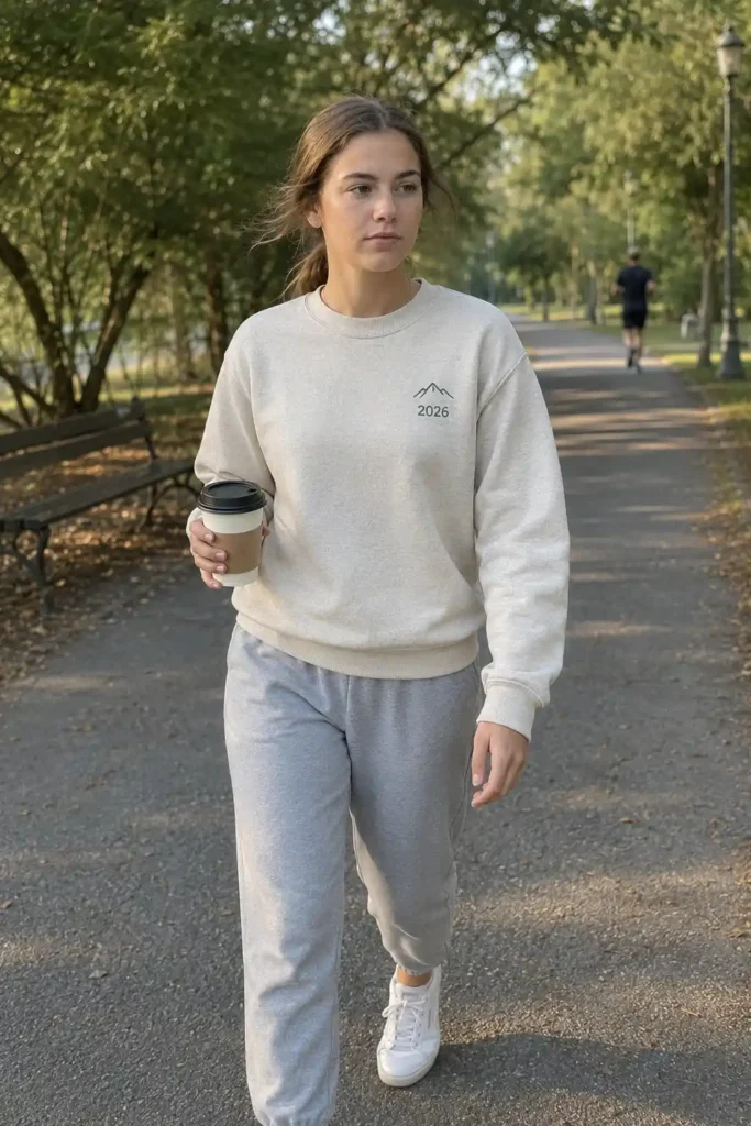
Not everyone wants a busy sweatshirt. A decent chunk of every graduating class wants something they’d genuinely wear to the grocery store years later, and that group gets ignored constantly.
- A single small icon (a cap, a diploma outline, an arrow) with just the year underneath.
- Monochrome embroidery only, no printed graphics at all, tone-on-tone.
- Left-chest small text, back left completely blank. This design consistently outsells the busier options in my experience, because people actually wear it with a blazer or jacket over it later.
Interactive or personalized designs
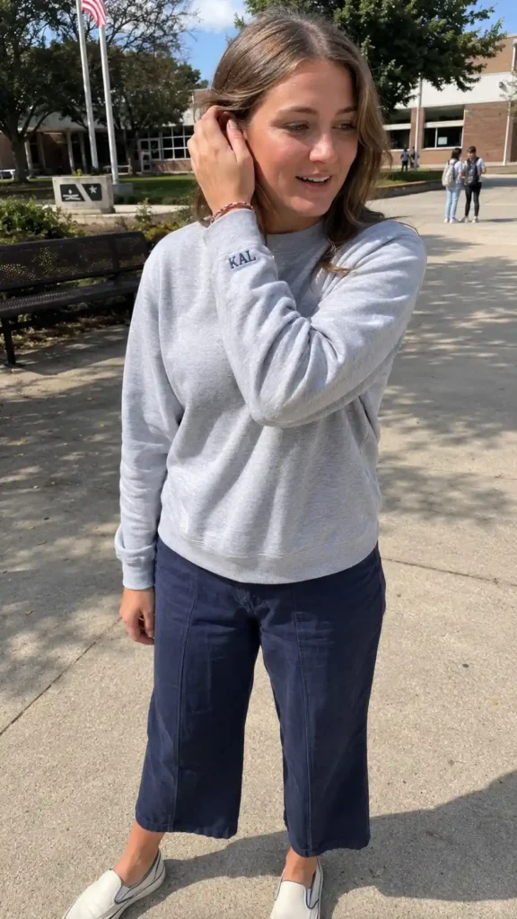
- A design with each senior’s initials printed in tiny text somewhere on the sleeve or hem, so every sweatshirt is technically identical but personal at the same time.
- A QR code stitched onto the tag linking to a class photo slideshow or shared playlist. A little gimmicky, sure, but I’ve seen it done well, and it gets people talking.
Quick comparison tabl
| Design style | Best for | Average cost per piece |
|---|---|---|
| Text-only | Budget-conscious classes | Low |
| Illustrated | Classes wanting a shareable design | Medium-high |
| Vintage/retro | Classes wanting long-term wearability | Medium |
| Minimalist | Classes with mixed style preferences | Low-medium |
Prices vary a lot depending on your printer and order size, but this gives you a rough sense of where each style lands relative to the others.
How to actually pick one as a group
Here’s the part committees mess up constantly: they let 40 people vote on 12 fully finished mockups, and everyone picks a different favorite, and nothing wins by a real margin.
Instead, narrow it down in two rounds. First, vote on style category (text, illustrated, vintage, minimal).
Then only build out 3 full mockups in the winning category. It cuts the noise and gets you an actual consensus instead of a 15% plurality nobody’s excited about.
A few practical opinion-based notes from having done this more than once:
- Order a physical sample before locking in a full batch. Colors look different on screen than on fleece, every single time.
- Skip trendy meme text unless your class agrees it’ll still be funny in five years. Most won’t age well, and that’s fine, but be honest about it going in.
- If your budget allows it, spring for embroidery on at least the small chest logo. It reads as noticeably higher quality than an all-print design, and it’s the detail people mention when they compliment the sweatshirt later.
Quick side note, and this has nothing to do with sweatshirts really, but doesn’t it feel like every school committee meeting somehow runs 45 minutes over no matter what’s on the agenda? Anyway, back to the designs.
If you want to mock these up before ordering, tools like Canva make it easy to test fonts and layouts for free before you commit to a printer. For the actual printing, sites like Custom Ink and Printful both let you upload a design and preview it on the exact sweatshirt style you’re ordering, which saves you from nasty surprises when the boxes arrive. And if you’re hunting for more visual inspiration before you settle on a direction, Pinterest is honestly still the best place to search “senior sweatshirt design” and see what other schools have already tried.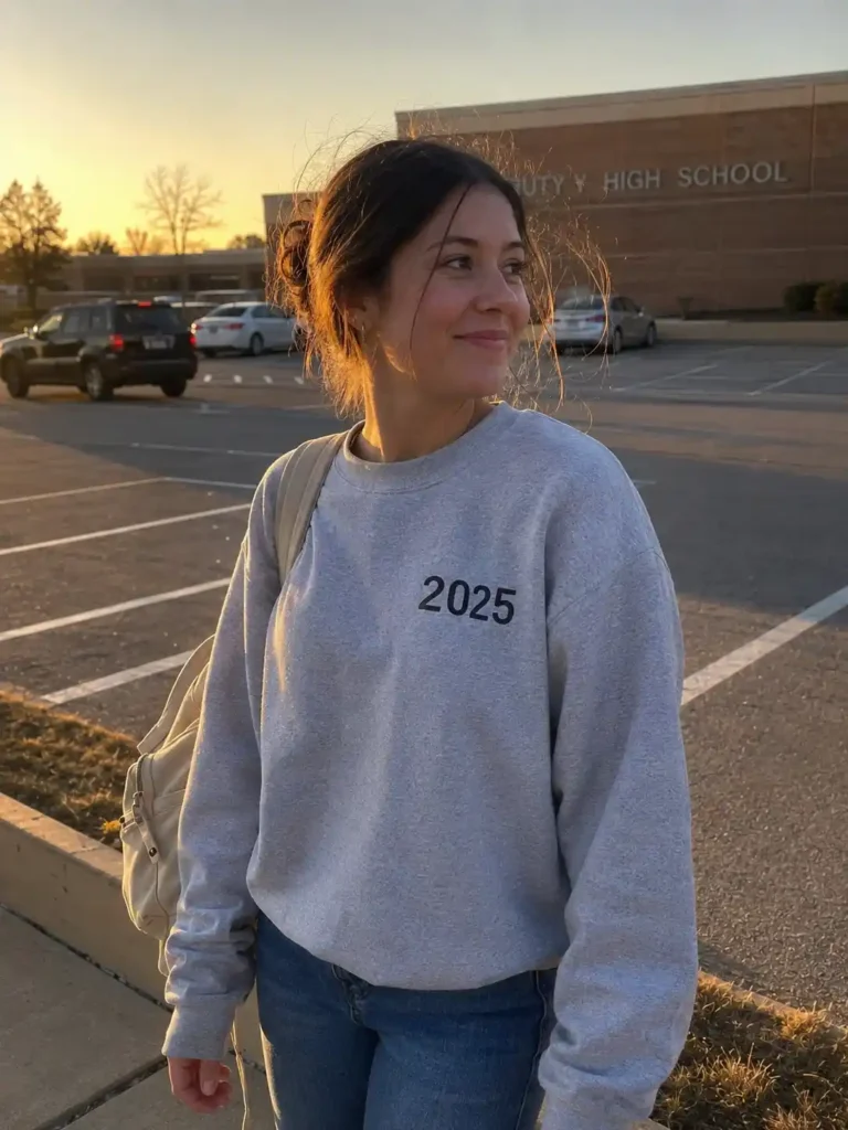
FAQs
How much should a senior class sweatshirt cost per person? Most classes land somewhere between $20 and $40 per sweatshirt depending on fabric quality, print method, and order size. Bulk orders of 100+ almost always bring the per-unit price down noticeably.
What’s the best print method for a design with lots of detail? Screen printing works fine for simple one or two-color designs, but if your artwork has gradients or fine detail, direct-to-garment (DTG) printing or embroidery for small logos will hold up better and look sharper.
How early should we start designing before graduation? Aim for at least 8 to 10 weeks before you need the sweatshirts in hand.
That covers mockup revisions, a sample order, and the actual bulk production time, which almost always runs longer than printers estimate.
Final thought
Picking a senior class sweatshirt design feels small in the moment, but it’s one of those things people end up wearing for years, long after the actual memories of senior year start to blur.
Wow, that got sentimental fast, but it’s true.
Which one of these 20 would your class actually vote for, and which one would start a group chat argument?
Drop it in the comments or save this to your Pinterest board so your committee can fight about it later.
