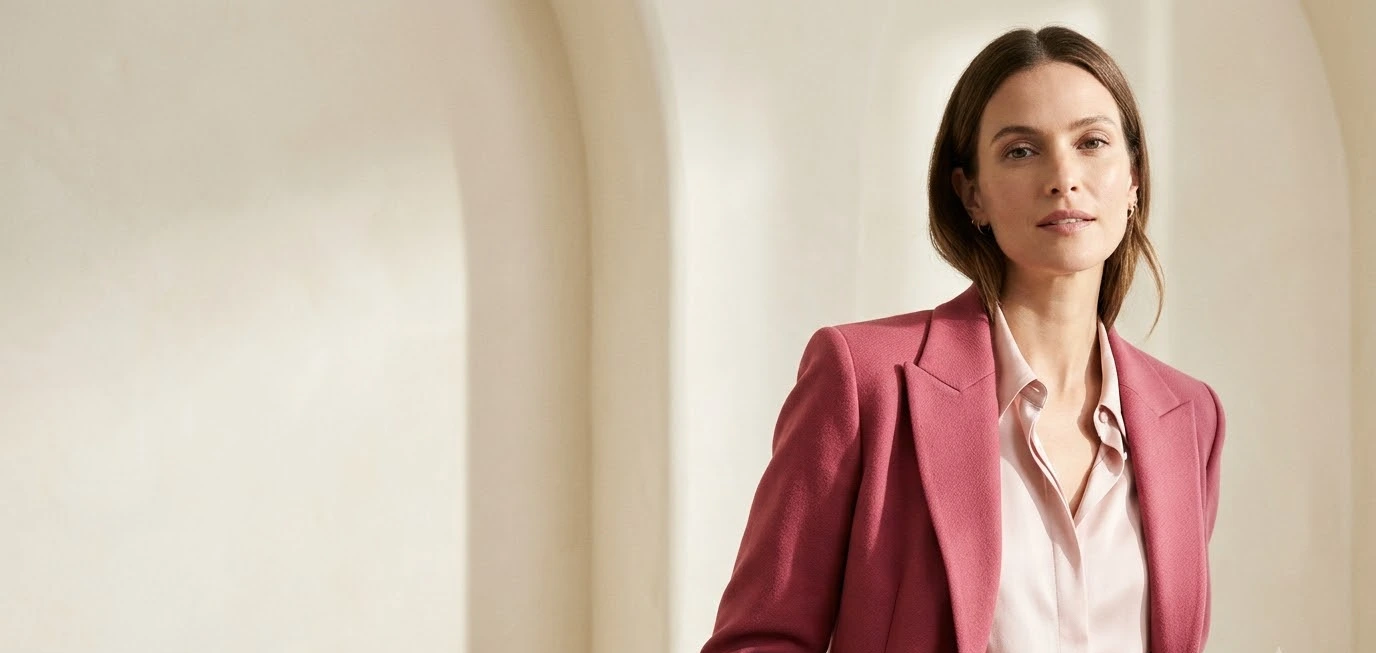
You’ve got a blush blouse in your closet and a hot pink skirt you bought on a whim. They look great on separate hangers. Together? You’re not sure, and that little doubt keeps one of them on the hanger.
I’ve been there. I spent most of one summer building pink-on-pink looks for boards, and I got plenty wrong before I got a few right.
This guide covers the pairings I’d actually wear and save: which pinks fight, which ones get along, and how to make the whole thing look planned.
How To Style A Skirt Christmas Party Outfit 15 Easy Holiday Combinations
Discover More →Why pink on pink works
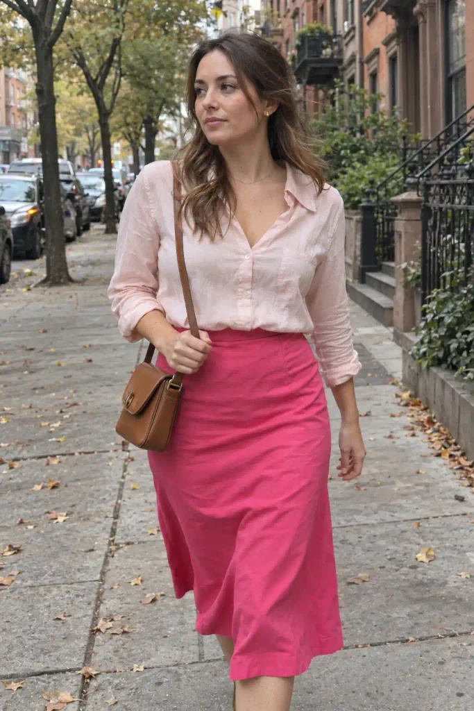
Pink is one color family with a huge range inside it. Pull a pale blush next to a deep fuchsia and your eye reads them as relatives.
That family resemblance is why the look feels cohesive even when the shades are far apart.
Designers use the same logic with tonal dressing. Stay inside one hue and change the depth, and the outfit looks intentional. Nobody wonders if you got dressed in the dark.
The camera loves it too. Pinterest users scroll fast, and a light and dark pink pairing makes a clear contrast that reads at thumbnail size. If you’re pinning outfit flats or snapping mirror shots, that matters.
For a quick refresher on how related colors behave, the Adobe Color wheel lets you test analogous combinations in about 30 seconds. I still use it when I can’t decide.
The undertone problem
Here’s where most pink outfits go sideways. Pinks lean warm (peach, coral, salmon) or cool (blue-based, like magenta and bubblegum). Mix a warm light pink with a cool dark pink and the outfit looks slightly off, even if you can’t say why.
The fix takes about 10 seconds. Hold both pieces together in daylight. If one looks orange-ish and the other looks purple-ish, swap one of them.
Know your pinks before you mix them
I find it easier to think in a few named groups than to stare at 50 shades. Here’s the cheat sheet I keep in my notes app.
| Pairing | Vibe | Best For |
|---|---|---|
| Blush + Magenta | Polished, bold | Work, dinners |
| Baby Pink + Hot Pink | Playful, bright | Brunch, weekends |
| Dusty Rose + Raspberry | Soft, moody | Fall, date night |
| Pastel + Deep Fuchsia | High contrast | Parties, photos |
Keep this handy and you’ll skip most of the trial and error. Each pairing gets its own section below with real outfit ideas.
Blush and magenta: the grown-up pairing
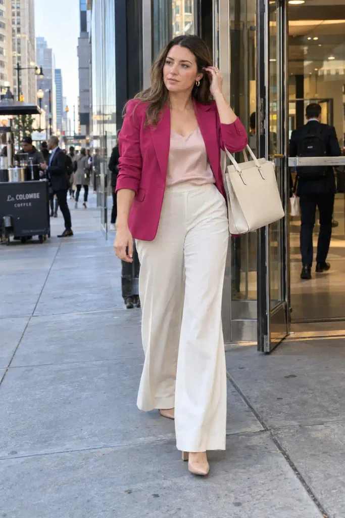
This is my favorite combination, and I’d start here if you’ve never worn two pinks together. Blush is soft and slightly warm. Magenta has enough blue in it to look sharp next to it.
Picture a magenta blazer over a blush silk camisole with wide-leg trousers in cream. That’s a work outfit that still looks interesting on a screen.
I wore a version of this to a client meeting and got asked where the blazer came from twice.
Easy ways to wear it
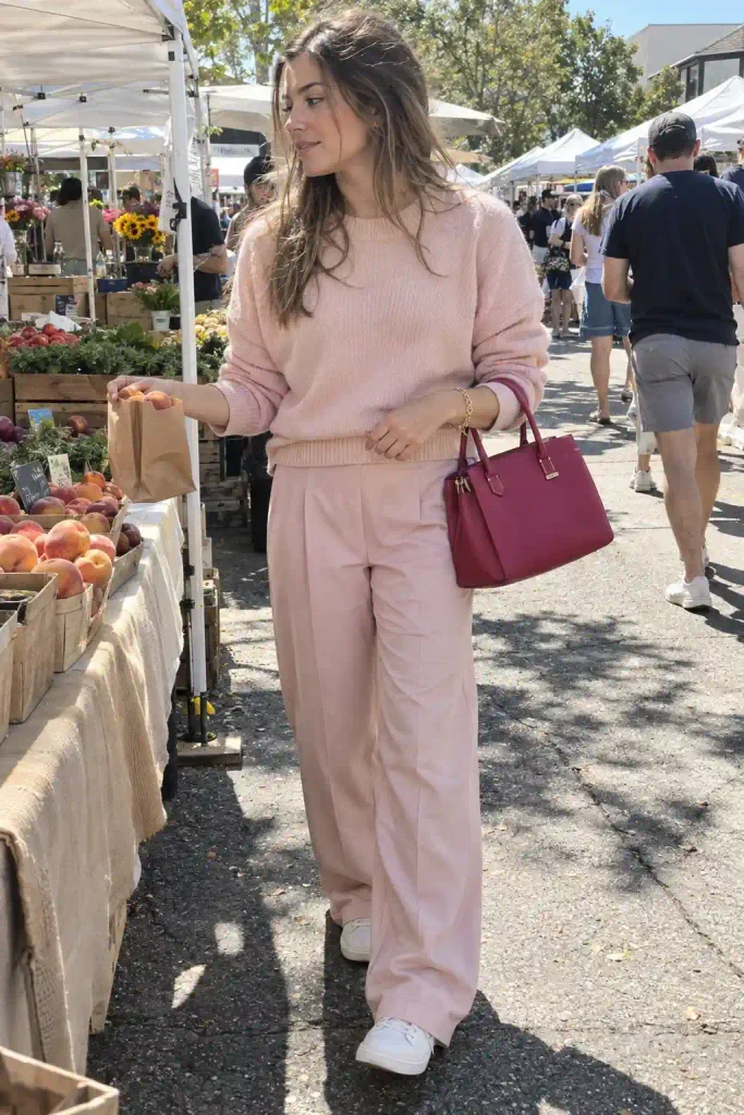
- Blush knit sweater with a magenta pleated midi skirt
- Magenta slip dress under an oversized blush trench
- Blush trousers with a magenta silk shirt, sleeves rolled
- Magenta bag with an all-blush outfit (the cheapest way to try the look)
My honest opinion: the bag version wins for beginners. You spend less, risk less, and still get the contrast.
Baby pink and hot pink: pure fun
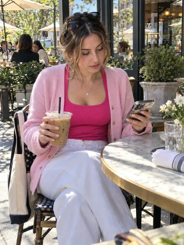
Wow, this one is loud, and I mean that as a compliment. Baby pink is cool and sweet. Hot pink is electric. Together they give you that bubblegum energy that photographs well in daylight.
IMO this pairing works best when you keep the silhouettes simple. A baby pink cardigan over a hot pink tank.
Hot pink wide-leg jeans with a baby pink tee. Let the colors do the talking and keep the cuts quiet.
Do you need to wear it head to toe? No. A hot pink belt over a baby pink dress does the job, and it takes the pressure off.
Where it can go wrong
Both shades are cool-toned, which helps, but the combination gets costume-y fast if you add ruffles, bows, and sparkle all at once.
Pick one detail and stop there. I learned this at a birthday party where I looked like a cupcake. Fun for photos, tiring to wear.
Dusty rose and raspberry: the moody one
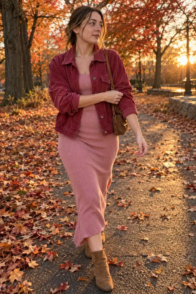
Dusty rose has gray mixed in. It’s muted, a little vintage, and the opposite of neon. Pair it with raspberry and you get a rich, autumn-leaning duo that looks expensive.
I love this for fall boards. Think a raspberry corduroy jacket over a dusty rose knit dress. Or a dusty rose turtleneck with raspberry wool trousers, which looks warm even in a flat lay photo.
Texture matters more here than in the brighter pairings. Matte, soft fabrics like wool, suede, and brushed cotton make both shades look deeper. Shiny polyester can make dusty rose look tired, so I skip it.
If you want to see how muted tones are trending, the Pinterest Predicts report tracks what people actually save each year, which beats guessing.
Pastel pink and deep fuchsia: maximum contrast
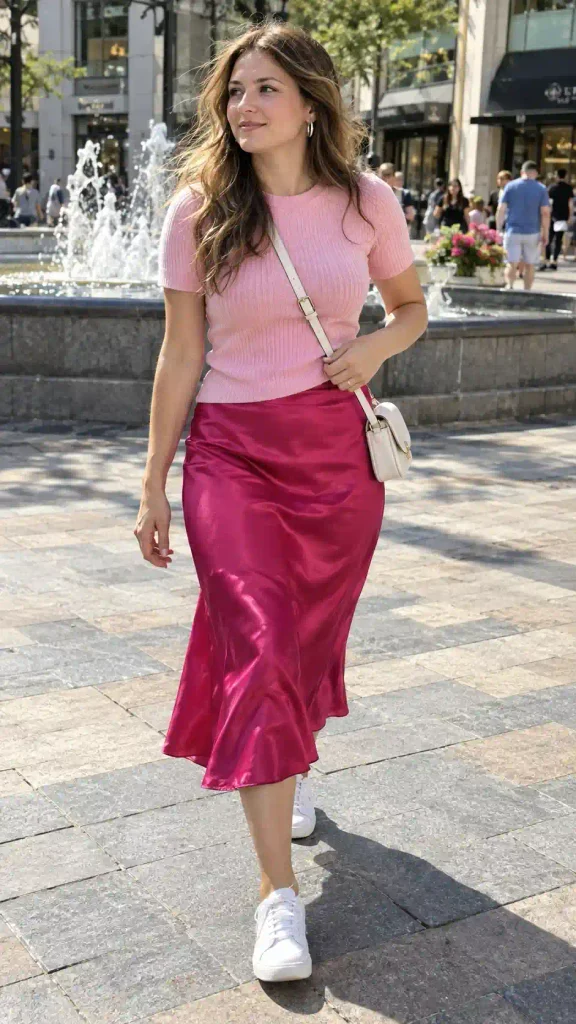
This is the high-drama version. The pastel is soft and the fuchsia is saturated, so the gap between them is huge. Your eye jumps between them, which makes the outfit look styled instead of matched.
It photographs beautifully. A fuchsia satin skirt with a pastel pink knit top and white sneakers is the kind of look that gets pinned a lot.
I’d also try a fuchsia coat over an all-pastel outfit if you want a statement that costs one purchase.
Two quick rules help here. Keep the deep shade for the piece you want people to notice, and let the pastel handle the rest of the outfit. If both pieces fight for attention, the look gets busy.
A quick off-topic thought
Side note: I once spent 40 minutes in a store arguing with myself about a $12 scarf, and I still think about that scarf. Color choices feel huge in the moment and tiny a week later.
If you love the combination, buy it. Pink is a cheap risk compared with most fashion mistakes.
Okay, back to the outfits.
Monochrome pink sets: the lazy genius move
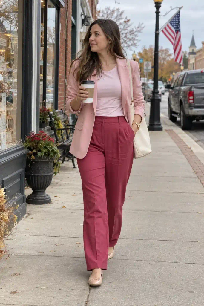
A matching set is the cheat code for pink-on-pink. One shade on top, a deeper shade on the bottom, and the outfit looks finished in about 3 minutes.
Here’s what I like:
- A light pink blazer with deep rose trousers
- A pale pink knit set with a darker pink cardigan thrown over it
- Ombre dressing, where you go from pale (top) to deep (bottom)
- A rose-colored tracksuit with a pale hoodie underneath (my honest weekend pick)
Ombre dressing looks tricky but it’s easy. Start with your lightest piece closest to your face and put the darkest piece at the hem or on your shoes.
The gradient looks smooth, and your outfit looks like it came from a mood board.
Neutrals that make pink look better
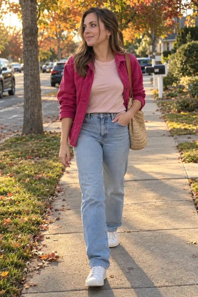
Two pinks already make a statement, so you probably want a calm third color. White and cream are my default. They give the pinks room to breathe.
Denim is the other one I reach for constantly. Light-wash jeans with a blush top and a fuchsia jacket look relaxed and put-together. Dark denim works too, and it grounds the brighter shades.
Tan and camel are underrated with pink. A camel coat over a pink-on-pink outfit looks warm and slightly vintage. Gray gives a cooler, more modern feel.
What about black? It works, but I use it carefully. Black next to hot pink looks sharp and a little punk, which is great if that’s your style. Next to blush it looks heavy, so I’d keep it to shoes or a bag.
Accessories, shoes, and bags
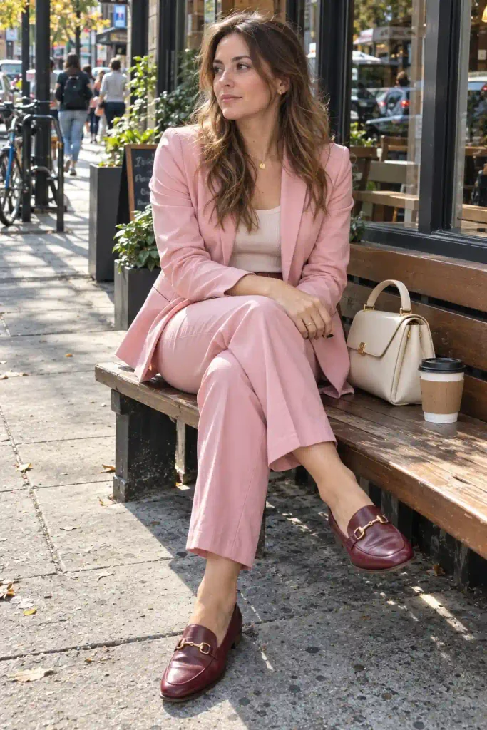
Accessories decide whether your outfit looks planned or chaotic. Gold jewelry warms up cool pinks and looks lovely with blush. Silver goes better with magenta and fuchsia.
For shoes, nude and white are the safest. A white sneaker keeps a pink outfit casual. A nude heel stretches your leg line and doesn’t compete with the color.
Want to go bolder? A shoe in the darker pink of your outfit pulls the whole thing together.
I wore burgundy-pink loafers with a pale pink suit last spring, and they got more compliments than anything else I owned.
Bags worth saving to your board
- A structured cream bag, which goes with everything
- A mini bag in the deeper shade of your outfit
- A woven straw tote for summer pink looks
- A clear or glossy bag if you want a playful edge
Fabrics and texture
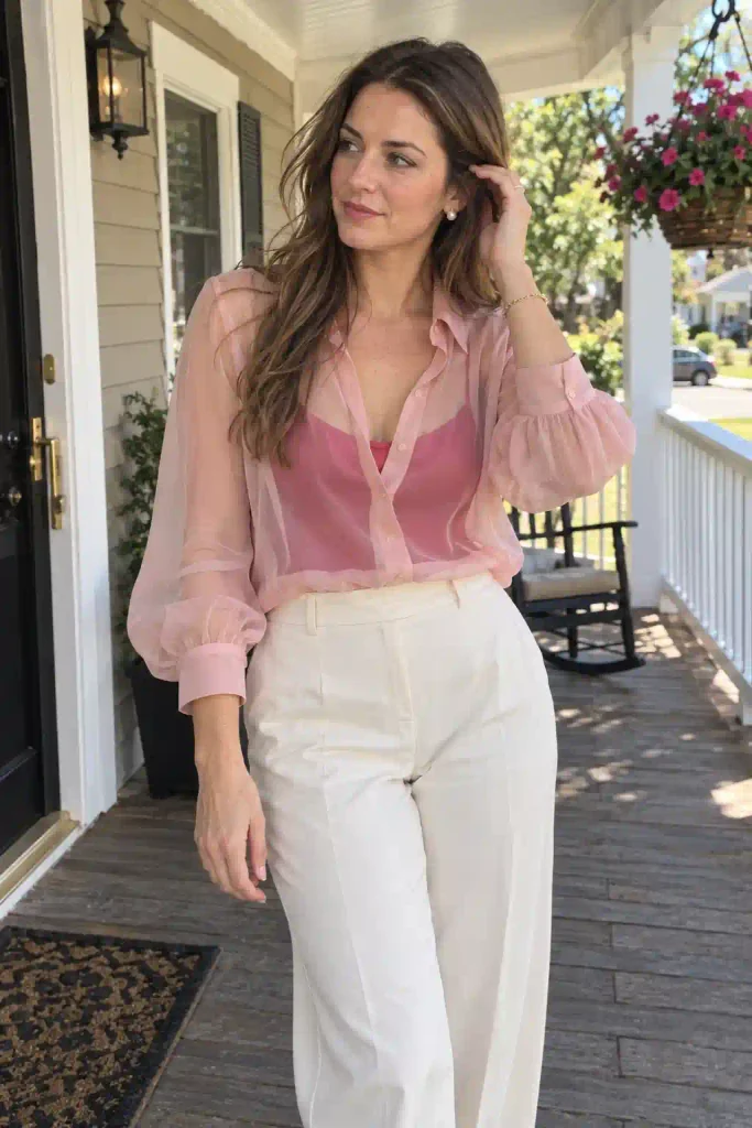
Fabric changes how a pink reads. Satin and silk make pinks look rich and reflective. Cotton and linen soften them. Knits add warmth.
I try to mix at least two textures in a pink-on-pink outfit. A smooth satin skirt with a chunky knit sweater looks better than two flat cotton pieces. The variation keeps the outfit from looking like a single blob of color.
Sheer fabrics are fun too. A sheer pale pink blouse over a deeper pink camisole gives you layering and color mixing in one go. FYI, this works best when the camisole is the darker shade, since it shows through the lighter layer.
Pink outfits by season
Season changes the shades that look right, so I think about it before I shop.
Spring and summer
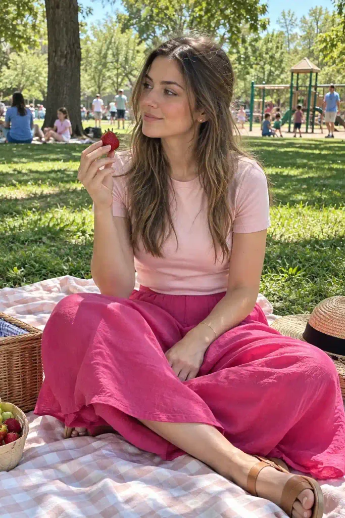
Go light and bright. Pastels and hot pinks look fresh in sunlight. Linen sets, cotton sundresses, and sandals fit the mood.
Pair a pastel top with a bold pink skirt and you have a picnic outfit that photographs well.
Fall and winter
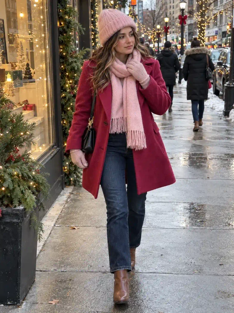
Deepen everything. Dusty rose, raspberry, and berry tones look cozy against wool and leather. A pale pink scarf adds lightness to a dark pink coat, which keeps a winter outfit from looking heavy.
I wear a soft pink beanie with a raspberry coat every December, and it still makes me smile 🙂
Christmas Party Looks Outfit Ideas 23 Stylish Looks To Try This Holiday Season
Discover More →How to make pink outfits look good in photos
Since you’re likely saving these ideas to a board, a few photo tips help. Natural light makes pinks look true to color. Indoor yellow bulbs push pinks toward orange, so I shoot near a window.
Simple backgrounds help too. A white wall, a neutral street, or a green hedge all make pink stand out. Busy backgrounds fight the outfit.
Try shooting from slightly below your waist so the outfit fills the frame. Vertical photos work best on Pinterest, so hold your phone upright.
If you want a deeper look at how color shows up in design, the Pantone Color Institute has plenty of reference material on how shades behave.
Mistakes I see (and made myself)
Here are the pink-on-pink problems that come up most. I’ve committed every one of them.
- Matching shades too closely, so the outfit looks like a mistake instead of a choice
- Mixing warm and cool pinks without testing them in daylight
- Adding too many patterns on top of two pinks
- Wearing pink on pink on pink with no neutral break
- Ignoring fit, since a poorly cut hot pink piece looks worse than a plain one
Shade distance is the big one. If your two pinks sit too close, say a blush and a slightly deeper blush, the outfit looks like a washing accident. Pick shades at least two or three steps apart.
Which pinks suit your skin tone?
I’m not a stylist, and I’d rather tell you that straight. Still, a few general patterns help.
Cool undertones (silver jewelry looks better on you) usually look great in magenta, fuchsia, and bubblegum.
Warm undertones (gold looks better) tend to love coral-leaning pinks and peachy blush. Neutral undertones can wear almost everything.
The best test is a mirror and daylight. Hold a piece near your face. If your skin looks bright and healthy, keep it. If you look tired, try another shade. The color wheel on Canva can also help you compare shades before you buy.
Quick FAQs
Can I wear light pink and dark pink together to work?
Yes. Blush with a deeper rose or magenta looks polished in a blazer-and-trouser set. Stay in matte fabrics and add a neutral bag to keep it professional.
What color shoes go with a two-pink outfit?
Nude, white, and cream are the safest picks. If you want to try something bolder, match your shoes to the darker pink in your outfit.
Do light and dark pink work for every body type?
They do. Darker shades draw attention, so put the deeper pink wherever you want the eye to land and the lighter one on the areas you’d rather keep soft.
Final thought
Pink on pink looks bold on the hanger and easy once it’s on. Pick two shades, test them in daylight, and wear the combination with a little confidence.
So which pairing are you saving first: blush and magenta, or baby pink and hot pink? Drop your pick in the comments, and pin your favorite combo to your board so I can see it.
