
Senior year sweatshirts used to mean one thing: a plain hoodie with your grad year slapped on the front in Arial font. Not anymore.
I spent way too many hours last fall scrolling Pinterest boards trying to figure out what my own senior sweatshirt should look like, and I learned a lot the hard way.
Some ideas photograph beautifully but feel awful to actually wear all day. Others look basic in a flat lay but somehow become the piece everyone asks about in real life.
This guide walks through what actually works, not just what looks good in a mockup.
If you’re pinning ideas for your own senior year, planning a class order, or just love browsing cozy outfit inspo, stick around.
I’m covering fit, color, text placement, fabric, and styling, plus a few mistakes I made so you don’t have to repeat them.
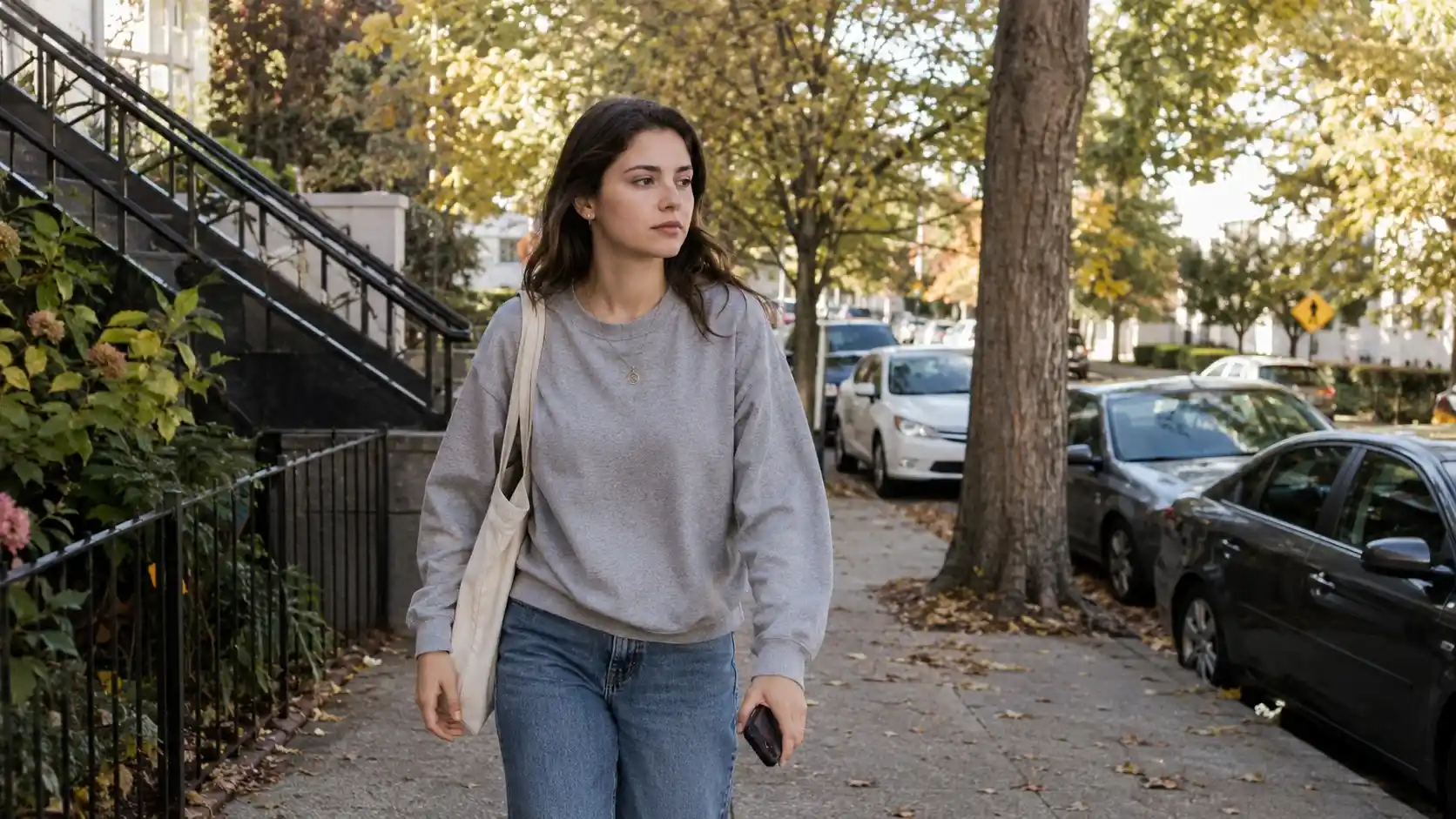
Why the sweatshirt became senior year’s signature piece
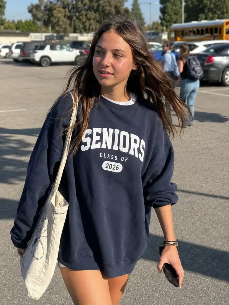
Class t-shirts had their moment. Now sweatshirts have taken over, and honestly, it makes sense.
A hoodie or crewneck works for football games in September and study sessions in January.
It photographs well for senior pics, road trips, and those last “we’re seniors” group shots everyone posts in August.
There’s also a comfort factor nobody talks about enough. Senior year is stressful.
College apps, finals, the whole “what am I doing with my life” spiral. A soft, well-fitted sweatshirt is basically a hug you can wear to class.
Oversized fit vs. classic fit: my honest take
This is where opinions get heated, and I’ll admit mine has changed. I used to think oversized was the only acceptable choice for that trendy, effortless look.
Now I think it depends entirely on your body type and how you plan to wear it.
Oversized crewnecks and hoodies work great if you want to:
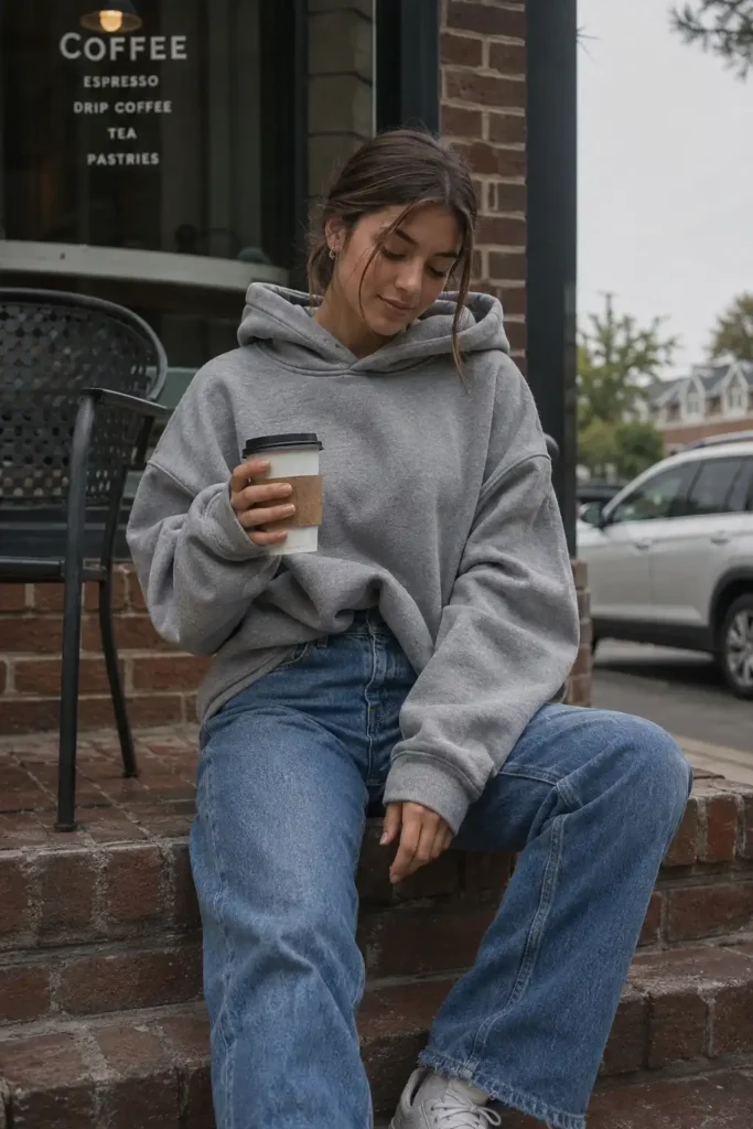
- Layer over a turtleneck or long sleeve for a dressed-up campus look
- Tuck the front into jeans for that dropped-shoulder, model-off-duty vibe
- Wear it as loungewear that doubles as an outfit for coffee runs
Classic or cropped fits work better if you want to:
- Show off high-waisted jeans or a skirt underneath
- Wear it under a jacket without looking bulky
- Keep a more polished, put-together silhouette for pictures
I own both, and I reach for the oversized one more often, mostly because it hides the fact that I didn’t do laundry this week.
IMO the fit matters more than the design itself when it comes to how often you’ll actually wear it.
Colors that don’t scream “generic class shirt”
Navy, gray, and black will always sell. They’re safe, they match everything, and they never look dated.
But if you want something that stands out on your camera roll, consider stepping outside the usual palette.
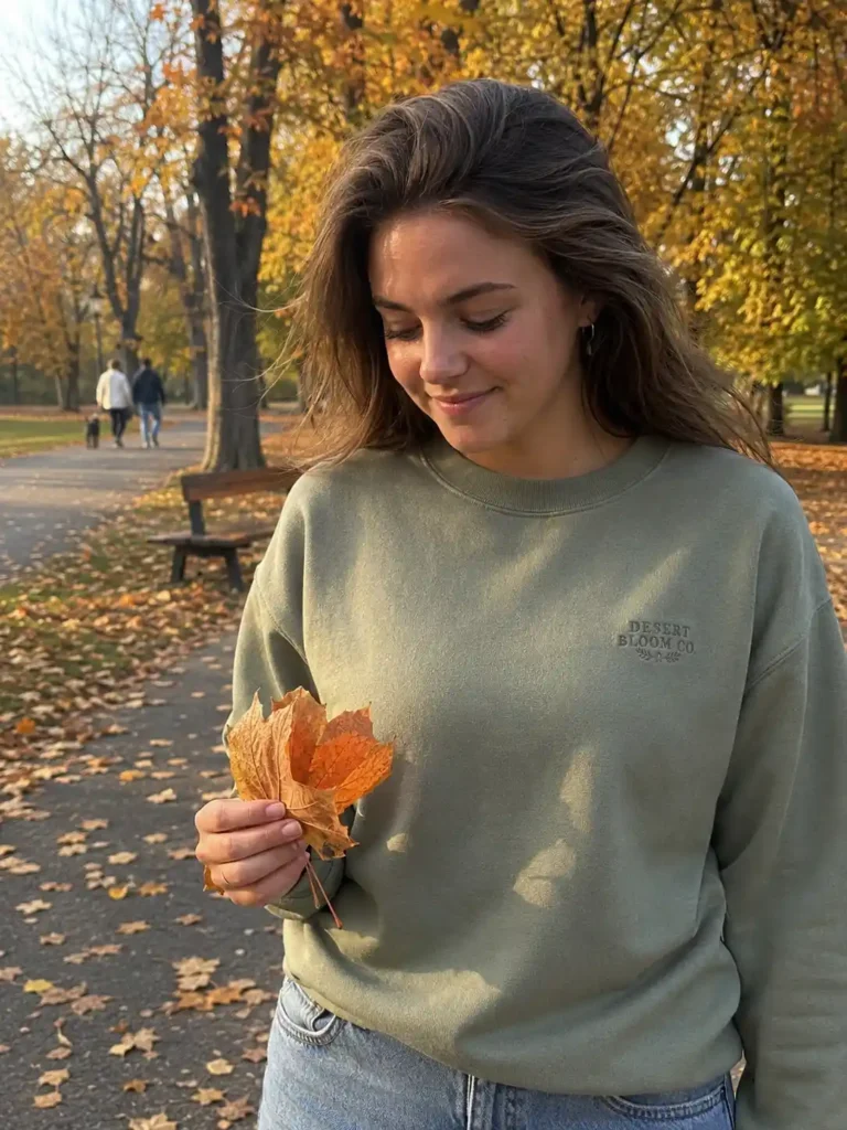
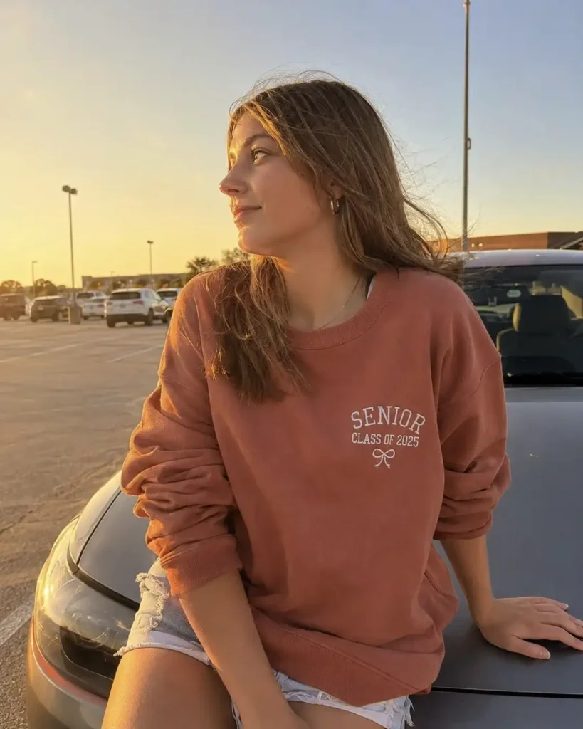
Sage green, dusty rose, and warm terracotta have been everywhere on style boards lately, and they photograph beautifully against fall foliage or a brick campus building.
Cream and butter yellow are having a moment too, especially paired with gold hardware or embroidered text instead of a bold print.
A small tip from experience: darker colors hide screen print cracking over time. Lighter colors show wear faster but look incredible in photos.
Pick based on whether you care more about longevity or that one perfect senior picture.
Typography and text placement ideas
The words on your sweatshirt matter almost as much as the color. Here’s what tends to look elevated instead of thrown together:
- Small chest text instead of a giant back print. A simple “Class of [Year]” in a serif or script font over the heart looks intentional, not loud.
- Vertical text down the sleeve. This one caught my eye scrolling boards last spring. It’s unexpected and reads as more custom than a standard front-and-center design.
- Embroidery over screen print. Embroidered text has texture and holds up wash after wash. Screen print eventually cracks, especially on high-friction spots like the chest.
- Mascot or school initial kept small and tonal (same color as the sweatshirt, just a different texture) instead of a huge contrasting logo.
Skip anything with too much text crammed onto one line. It reads cluttered in photos and honestly, nobody wants to squint to read your own hoodie.
Matching sets vs. individual pieces
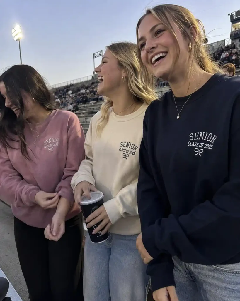
Friend groups love ordering matching sweatshirts, and I get the appeal. There’s something fun about a whole squad in coordinated colors for a football game.
But here’s a comparison worth thinking through before you commit to a bulk order.
| Option | Best For | Downside |
|---|---|---|
| Exact matching sweatshirts | Big group photos, school spirit events | Everyone looks identical, less individuality |
| Same design, different colors | Friend groups who want cohesion without twinning | Slightly harder to coordinate ordering |
| Individual custom pieces | Personal style, solo senior pics | More expensive per person, no group cohesion |
My friend group went with option two senior year, same little embroidered design, but each of us picked our own color.
It photographed just as well as matching sets and nobody complained about “wearing a costume.”
Fabric actually matters more than you’d think
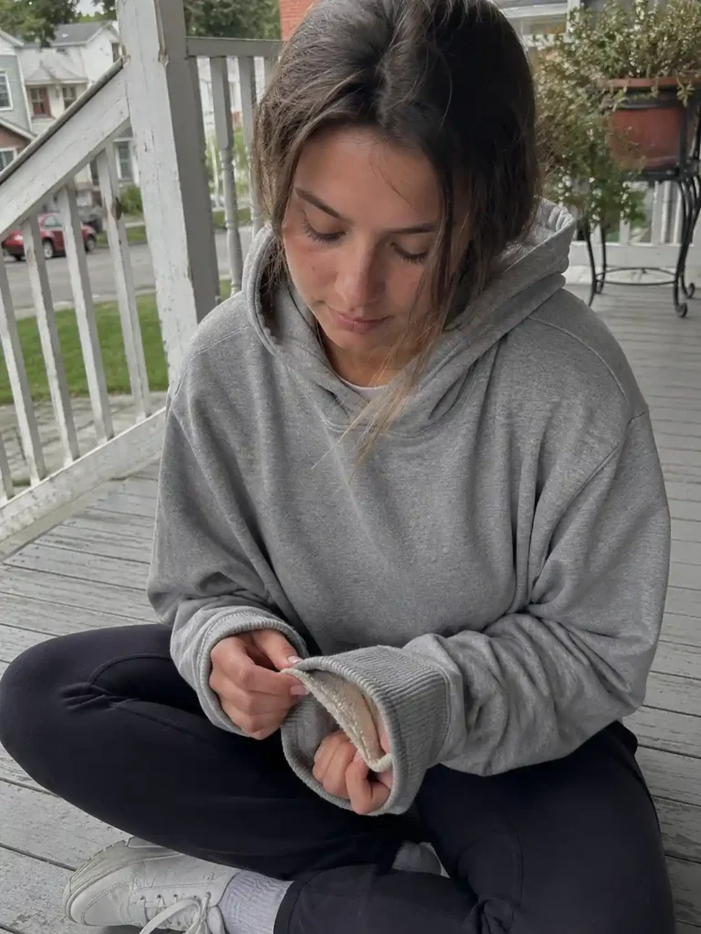
This part gets skipped in most Pinterest captions, and it shouldn’t.
A gorgeous design on cheap fabric pills within a month. Before ordering anything, check what it’s actually made of.
- Fleece-lined hoodies feel amazing in cold weather but run warm indoors, so they’re better for outdoor games than all-day classroom wear.
- French terry sweatshirts are lighter, breathe better, and still look put together. IMO this is the most underrated option for daily senior year wear.
- Cotton-poly blends hold their shape longer and resist shrinking in the dryer, which matters if you’re keeping this sweatshirt as a memory piece for years.
A quick site like Etsy is worth browsing just to see how small shops describe their fabric weights before you order in bulk from anywhere.
Styling ideas that actually get pinned
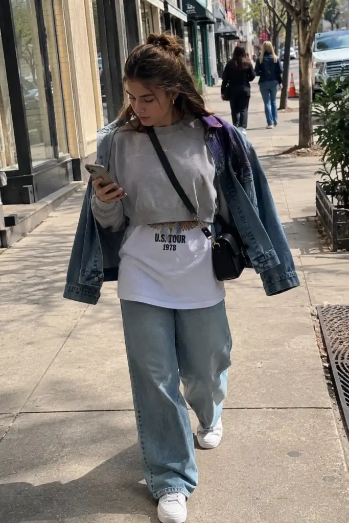
Here’s where the visual appeal really comes together. A great sweatshirt design means nothing if the outfit around it looks like an afterthought.
Try layering a cropped sweatshirt over a longer graphic tee so a bit of the hem peeks out underneath.
Add straight-leg or wide-leg jeans and sneakers for that easy, editorial look that performs so well on style boards.
For cooler days, throw an open flannel or denim jacket over the top and leave it unbuttoned.
Accessories genuinely change everything here. A crossbody bag, chunky sneakers, or even a claw clip pulls the whole outfit together without much effort.
Honestly, this is where I get slightly distracted every time I plan an outfit, because I’ll spend twenty minutes deciding between two nearly identical pairs of white sneakers instead of just picking one. We’ve all been there.
Where to find or design your own

If your school doesn’t have an official order form yet, plenty of print-on-demand sites let you design something custom without a huge minimum order.
Sites like Canva make it simple to mock up your own design before sending it to a printer, even if you have zero graphic design background.
For inspiration boards specifically, Pinterest remains the best place to collect ideas before committing to one final design.
Save a handful of options, sit with them for a few days, and see which one you still love a week later. That’s usually the real answer.
Seasonal versions of the same sweatshirt

One thing I didn’t think about until it was too late: senior year spans three seasons, and one heavy hoodie doesn’t cover all of them.
If you’re planning ahead, it helps to think in terms of a small capsule instead of a single piece.
For early fall, a lighter French terry crewneck works best.
You’re layering it over tank tops for warm afternoon games, and anything heavier gets uncomfortable fast once the sun’s out.
By late fall and into winter, a fleece-lined hoodie earns its place, especially for tailgates or outdoor ceremonies where you’re standing around for hours.
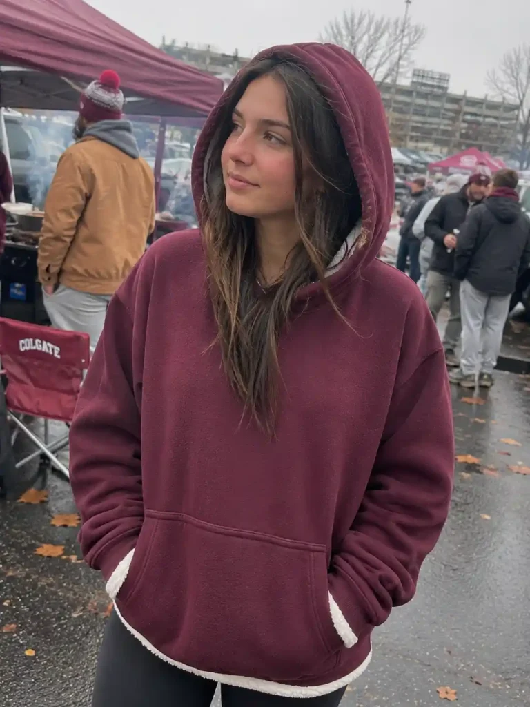
Spring is where people get it wrong most often.
A lot of seniors order one heavy sweatshirt in August and then have nothing lightweight for April and May, right when prom, senior skip day, and graduation prep are all happening.
A quarter-zip or a thinner crewneck in a spring-friendly color solves that gap. If your budget allows it, ordering two weights of the same design, one heavy and one light, gives you something to wear practically year-round instead of a single piece that only works for four months.
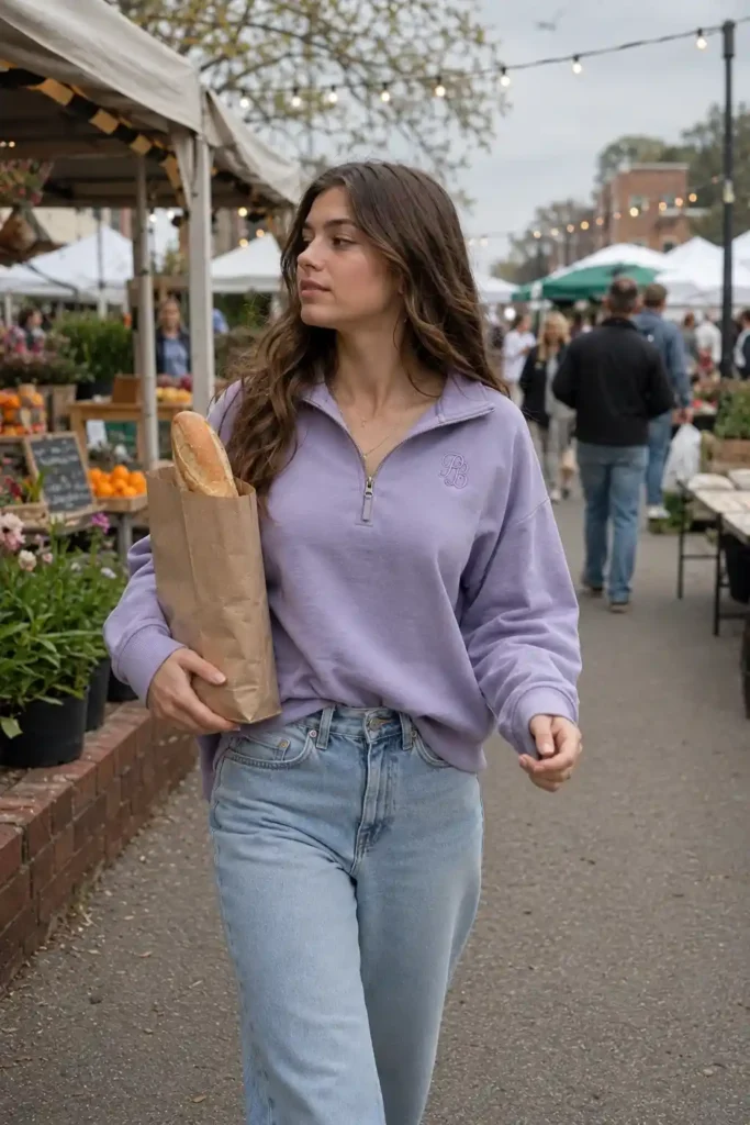
This is also where personalization pays off. A hoodie you’ll wear from September through graduation deserves a design you won’t get tired of.
I regretted ordering a design with a trendy phrase on it, because by March I was over reading it every single morning.
A simple monogram or year number ages a lot better than a phrase that felt clever back in August.
Common mistakes to avoid
A few things I wish someone had told me before I ordered mine:
- Ordering true to size instead of sizing up. Sweatshirts shrink a little in the wash almost every time.
- Choosing a trendy color that clashes with your school colors. Sounds obvious, but it happens more than you’d think.
- Skipping a sample order before committing to 40 shirts for the whole grade. Always request one first if you’re ordering in bulk.
Frequently asked questions
What’s the most flattering sweatshirt fit for senior pictures? A slightly oversized crewneck tends to photograph the best because it drapes nicely without adding bulk. Cropped styles work too if you’re pairing them with high-waisted bottoms.
Should I go with screen print or embroidery for a senior sweatshirt? Embroidery lasts longer and looks more polished up close, but it costs more per piece. Screen print is budget-friendly and works fine for smaller text or simple designs.
How do I keep a group order from looking too matchy? Stick to one shared design element, like the same font or small icon, and let everyone pick their own base color. It keeps things cohesive without feeling like a uniform.
Final thought
Your senior sweatshirt is going to end up in more photos than you’d expect, and honestly, you’ll probably still be wearing it during your first semester of college. Pick something that feels like you, not just something that matched a trend for five minutes on Pinterest.
What’s your favorite color and text combo so far? Save this article, pin your top three ideas, and drop a comment with what you’re leaning toward. I’d genuinely love to see what you land on.
